Regex tutorial — A quick cheatsheet by examples
Regular expressions (regex or regexp) are extremely useful in extracting information from any text by searching for one or more matches of a specific search pattern (i.e. a specific sequence of ASCII or unicode characters).
Fields of application range from validation to parsing/replacing strings, passing through translating data to other formats and web scraping.
One of the most interesting features is that once you’ve learned the syntax, you can actually use this tool in (almost) all programming languages (JavaScript, Java, VB, C #, C / C++, Python, Perl, Ruby, Delphi, R, Tcl, and many others) with the slightest distinctions about the support of the most advanced features and syntax versions supported by the engines).
Let’s start by looking at some examples and explanations.
- Basic topics
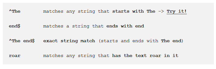
Anchors — ^ and $
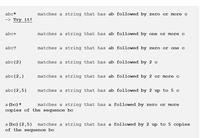
Quantifiers — * + ? and {}
- Summary
As you’ve seen, the application fields of regex can be multiple and I’m sure that you’ve recognized at least one of these tasks among those seen in your developer career, here a quick list:
- data validation (for example check if a time string i well-formed)
- data scraping (especially web scraping, find all pages that contain a certain set of words eventually in a specific order)
- data wrangling (transform data from “raw” to another format)
- string parsing (for example catch all URL GET parameters, capture text inside a set of parenthesis)
- string replacement (for example, even during a code session using a common IDE to translate a Java or C# class in the respective JSON object — replace “;” with “,” make it lowercase, avoid type declaration, etc.)
- syntax highlightning, file renaming, packet sniffing and many other applications involving strings (where data need not be textual)
A Complete Guide to Grid
CSS Grid Layout (aka “Grid”), is a two-dimensional grid-based layout system that aims to do nothing less than completely change the way we design grid-based user interfaces. CSS has always been used to lay out our web pages, but it’s never done a very good job of it. First, we used tables, then floats, positioning and inline-block, but all of these methods were essentially hacks and left out a lot of important functionality (vertical centering, for instance). Flexbox helped out, but it’s intended for simpler one-dimensional layouts, not complex two-dimensional ones (Flexbox and Grid actually work very well together). Grid is the very first CSS module created specifically to solve the layout problems we’ve all been hacking our way around for as long as we’ve been making websites.
- display
Defines the element as a grid container and establishes a new grid formatting context for its contents.
Values:
- grid – generates a block-level grid
- inline-grid – generates an inline-level grid

- Properties for the Children(Grid Items)
Note: float, display: inline-block, display: table-cell, vertical-align and column-* properties have no effect on a grid item. grid-column-start grid-column-end grid-row-start grid-row-end
Determines a grid item’s location within the grid by referring to specific grid lines. grid-column-start/grid-row-start is the line where the item begins, and grid-column-end/grid-row-end is the line where the item ends.
Values:
-
– can be a number to refer to a numbered grid line, or a name to refer to a named grid line - span
- the item will span across the provided number of grid tracks - span
– the item will span across until it hits the next line with the provided name - auto – indicates auto-placement, an automatic span, or a default span of one
.item {
grid-column-start:
Common Responsive Layouts with CSS Grid (and some without!)
CSS grid is now supported in Samsung internet v6.2 and many other modern browsers and has been the answer to many a prayer of web developers everywhere. In the same way that flexbox gave us a way to layout block elements next to each other, CSS grid lets us not only arrange elements in a row or a column, but in multiple rows and columns. Finally two dimensional layouts are becoming simpler!
When I was learning CSS and HTML the way that I learnt best was by copying layouts written by others and then changing bits, deleting bits and playing around with them until I understood what was going on. With that in mind, I’ve composed a few common responsive website layouts for you to copy, edit, mess around with. I’ll go over my thinking with each layout and will outline a few tricks from each one. (NB, you may have noticed that I’m not a designer, so I hope you like cats!). I’ve moved the CSS in each demo that is relevant to the layout up to the top of the CSS file in comment blocks so that you can see the important parts easily, don’t write your CSS like this.
The smaller images (in a grid!) are in the perfect layout to get you started with CSS grid. Grid gives us control over how wide or narrow each of the ‘grid cells’ get. This allows us to maintain a sensible aspect ratio to their height. In this example I’ve used:
grid-template-columns: repeat(auto-fill, minmax(250px, 1fr));
This image gallery layout uses features of CSS grid to create different sizes of grid cells. I’ve used the span value on grid-columnand grid-row to make individual cells stretch over two or more slots in the track. The line
grid-template-columns: 1fr 1fr 1fr 1fr 1fr 1fr;
will create a grid with 6 columns which are each one fraction unit wide. They each share 1/6 of the width of the container. You could also use
grid-template-columns: repeat(6, 1fr);
to get the same result. Using the span value with a number will make a grid cell span that many rows, or columns . grid-column: span 2; for example, will create a cell that is two columns wide. I’ve used object-fit again to make the images keep their aspect ratio while filling the space of their containers. If the images in your gallery have more constraints than cat pictures, with regards to the space they’ll fit in then you can use media queries to change the number of rows or columns they span at different widths.
References:
-
Regex tutorial — A quick cheatsheet by examples Read the full article here
-
A Complete Guide to Grid Read the full article here
-
Common Responsive Layouts with CSS Grid (and some without!) Read the full article here